Whether you have an eCommerce website or just a plain old business website, putting a search bar in it can work wonders in improving its user experience. Dropping a search feature in your website helps users find what they’re looking for, which is why you should have your web developer add this and make sure they consider these quick tips in designing the perfect search bar for your website.
- Include a text field and a search button
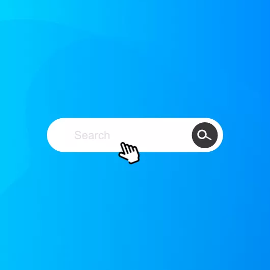
Some websites that employ a minimalistic approach in their web design tend to search bars without buttons, while some do it the other way around, where there’s just the button present. It’s highly recommended to put both elements on your website to guide your visitors better. The button can be something as simple as an icon of a magnifying glass or the word “search” placed beside the bar. You can always take some design liberties like adding background contrast, colour, etc. What matters is that a text field and the button is there to avoid confusing your users.
- Place your search bar in an easy-to-locate area on your website
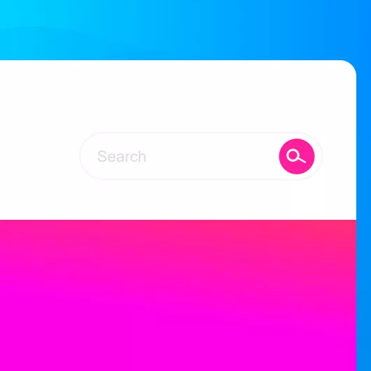
Typically search bars are placed in either the top-right or top-centre portion of the web page. Both are great placement options as they ensure the search functionality is visible and readily available for those who need it. Putting it in any other location is not a good idea as people aren’t used to finding it in other sections on most websites.
- Use placeholder text to guide users on what they can search for
Placing a sample search query as placeholder text is an excellent way to guide users whenever they want to do a quick search on your site. This is especially useful for websites with search bars where users can search for different items. However, be sure to limit the length of your placeholder text to reduce cognitive load and ensure that there is enough contrast for it to be legible.
- Incorporate an auto-suggest feature for your users
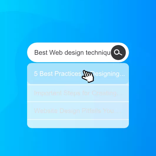
Most of the time, people ignore the auto-suggest functionality of search bars and usually take them for granted. However, if they’re unsure of what to search for, this functionality can come in handy. The auto-suggest feature guides users when they are typing out their search queries to avoid errors in search query formulation. However, you need to make sure that the suggestions are helpful and as much as possible relevant to avoid confusing or distracting users. It’s also best to limit the number of suggestions to avoid overwhelming the user.
- Put your search bar on every page on your website
That may sound excessive, but it’s actually quite helpful to your users. No one wants to go back to the home page just so they can use the search function again. Making your search bar available at all times makes it that much easier for users to navigate through your website and find what they’re looking for. In your custom web design, it’s essential to make your search bar accessible to users on any page, especially in 404 and other error pages. That way, even if users hit a dead end, they can easily navigate their way back and continue with their search.


Conclusion
The search bar is an easily overlooked element during a website’s design process, yet users depend on it all the time to find specific information. This is especially true for content-heavy websites and eCommerce sites where they feature multiple products at a time. Understanding these design considerations can help improve your website’s user experience just by focusing on the search bar.
If you need help building a fully functioning website for your website, there’s only one name to choose from. F8 Media is a graphic design and web design company aimed at helping you build your brand in the digital world. Let our team of web design specialists help you create a positive shift in how you do business. Contact us today to get started on your project!


